

Original Post

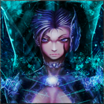

[R] 30k Signature Request - Update fl0w image
Stock image:

The final product must be of the same dimensions as the stock image provided. You may re-size the stock image + use it in the art, and do not be afraid of changing the colour scheme. Remember that fl0w has a zero in the tag, not an o (oh)
Please use my current set as a reference.
It is possible to /dl /lp my textures if you wish to use the tori model in the signature.
I'd like some aspect(s) of either my Tori or the set art to be included in the final piece.
Thank you
Reference - Samurai Set

The final product must be of the same dimensions as the stock image provided. You may re-size the stock image + use it in the art, and do not be afraid of changing the colour scheme. Remember that fl0w has a zero in the tag, not an o (oh)
Please use my current set as a reference.
It is possible to /dl /lp my textures if you wish to use the tori model in the signature.
I'd like some aspect(s) of either my Tori or the set art to be included in the final piece.
Thank you
Last edited by Deuteria; Jan 20, 2016 at 09:19 AM.
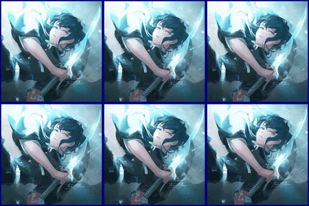

xxGangstaxx: Not what I'm looking for, thanks Try again if you like.
Fluxorious: I have updated OP post with request guidelines.
Thank you
Try again if you like.Fluxorious: I have updated OP post with request guidelines.
Thank you
I really like the idea I think if you're going to include the Tori, you should put the whole thing into it.
I feel that the "FL0W" part is too obscured by the arrows/too much going on. Could you also try "fl0w" and show me how that looks?
If you turn on shaders, the textures should look better. Also, depending on which shader you load in Utilities the reflection on the force should disappear.
Thanks!
Here's a few examples I just thought of:

I think if you're going to include the Tori, you should put the whole thing into it.I feel that the "FL0W" part is too obscured by the arrows/too much going on. Could you also try "fl0w" and show me how that looks?
If you turn on shaders, the textures should look better. Also, depending on which shader you load in Utilities the reflection on the force should disappear.
Thanks!
Here's a few examples I just thought of:
Last edited by Deuteria; Jan 20, 2016 at 05:39 PM.
Originally Posted by Fluxorious

On my laptop (which im working on) Fluid Blood High Poly Models and Shaders are not avaible because its way to bad xD it cant handle all that and i cant turn in on just for a screenshot. I will have to go on my gaming pc and make the screen there.
My computer heats up just thinking about that
I was meaning only shaders, not the sub-levels of graphics options such as ray-tracing or fluid blood. You decide which looks better
Originally Posted by Fluxorious
1. who are the other2 Toris? or should i just do your Tori x3
Each Tori represents a different idea, a different signature, but you could include them all. Just make two Uke and Tori.
Originally Posted by Fluxorious
2: are the Rays on your pic still all arrows or should i change them to just... rays?
Just rays, but I like the swirl effect you have.
Originally Posted by Fluxorious
3. it already says ,,fl0w" the Font just doesnt Support capital Letters so they all look equal in size, you can look around on dafont.com and tell me which Font you would like
Ok, that's fine
Font
http://www.dafont.com/mixit.font?text=flow&back=theme
Originally Posted by Fluxorious
When my Questions are answered i will work on a Picture Where the Text ,,fl0w" is falling on a Tori that ,,Rays" it another Tori on the Side that ,,Rays" it and a third Tori that Kicks it so hard the Text Cracks ! ;) i think i should be able to do that
This could work! Awesome
Last edited by Deuteria; Jan 21, 2016 at 02:05 AM.
Reason: <24 hour edit/bump