

Original Post



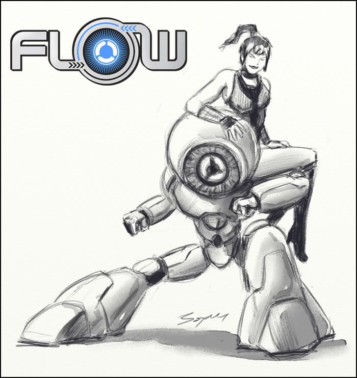
[art] Cover page for the [fl0w] codex
Since our clan got official I took the job upon myself to redesign the look of the new [fl0w].
After making a logo and banner, it was time to form our new ''mascots'' :]
We had one already: Wushu Mistress :P (she can teach you new form of se... martial art), and now we have another one: f-10-w, wushu-robo, together they are dynamic duo. He is cold and methodical martial artist, and she is... well, you have to meet her to know her. :P
Anyway, sketch used:
Final cover page:

Last edited by 8OJ4N; Apr 3, 2011 at 08:13 PM.


one of the greatest covers i ever seen ;p
Bojan we <3 you really
Bojan we <3 you really

You completely suck at drawing and coloring humans. But I do like the robot a lot.
The horrific thick colorful outline the text "FLOW" got in the final is really bad.... Instead of giving it an outline you could probably just cut out the same thickness from the darker line, creating a outline from the cutout instead of adding one.
The horrific thick colorful outline the text "FLOW" got in the final is really bad.... Instead of giving it an outline you could probably just cut out the same thickness from the darker line, creating a outline from the cutout instead of adding one.
Last edited by Freelancer; Apr 3, 2011 at 10:41 PM.
Jalis: Freelancer, you're a duck | Sachi: Freelancer, you're a duck | Reanimator: Freelancer, you're a duck
satiknee: Freelancer, you're a duck | Wiggi: Freelancer, you're a duck | Tarlan: Freelancer, you're a duck
satiknee: Freelancer, you're a duck | Wiggi: Freelancer, you're a duck | Tarlan: Freelancer, you're a duck
You completely suck at drawing and coloring humans

Chose one of the following responses:
a) [my level]
Critique of this kind looks more like a wibbles material.
If it came from someone who is using more his brush then his mouth on the art thread, I would have taken it better. But, said like this, it's more of an insult then constructive suggestions.
I may have not studied art at some fancy university, I learned (and I'm still learning) lots of stuff on my own, but portraying my knowledge so far with: ''completely suck'' have made me to wonder: May it be that I'm commented by an envy child? :{
I was evaluated by some prominent figures from comic industry in my country, u know. Even in a small country like mine, my work wouldn't be published if it ''completely sucked''.
b) [your level]
Nuts!
Sigh, always so childish.
The lightning on the human isn't correct. Face looks awful and also looks quite flat. Boobs shaped in a unrealistic way. The coloring seems rushed and doesn't contain any depth at all. The visible armpit area is really weird looking. Hair is choppy and doesn't fit the rest.
I do like how the legs are drawn and stuff tho.
The lightning on the human isn't correct. Face looks awful and also looks quite flat. Boobs shaped in a unrealistic way. The coloring seems rushed and doesn't contain any depth at all. The visible armpit area is really weird looking. Hair is choppy and doesn't fit the rest.
I do like how the legs are drawn and stuff tho.
Jalis: Freelancer, you're a duck | Sachi: Freelancer, you're a duck | Reanimator: Freelancer, you're a duck
satiknee: Freelancer, you're a duck | Wiggi: Freelancer, you're a duck | Tarlan: Freelancer, you're a duck
satiknee: Freelancer, you're a duck | Wiggi: Freelancer, you're a duck | Tarlan: Freelancer, you're a duck