





Thanks for commenting guys. Maybe I could edit those cones.
Anyway, it's for sale:
http://forum.toribash.com/showthread.php?t=281496
Anyway, it's for sale:
http://forum.toribash.com/showthread.php?t=281496
Last edited by pal; Jun 21, 2011 at 06:12 PM.

Oh, man I love how you did most of the detail
asymmetrically it just gives the texture a great touch to it.
Anyway, could do with some improvements
around the sides since they look quite blurry, but the top looks way more clean.
What I would suggest doing is going over
it with a duplicated layer which has low opacity and different tones to make it blend in better without being so blurry.
As everyone else said you should sort out the cone things they don't suit the head very well.
Just to let you know this is all my opinion and I have got to admit, this is one of the best heads I have seen from you!
Also, did you use any brushes?
asymmetrically it just gives the texture a great touch to it.
Anyway, could do with some improvements
around the sides since they look quite blurry, but the top looks way more clean.
What I would suggest doing is going over
it with a duplicated layer which has low opacity and different tones to make it blend in better without being so blurry.
As everyone else said you should sort out the cone things they don't suit the head very well.
Just to let you know this is all my opinion and I have got to admit, this is one of the best heads I have seen from you!
Also, did you use any brushes?
Last edited by notnoob; Jun 22, 2011 at 05:26 PM.
Sold my dog to join RRO


the head is a reward to your hard work. i really love the shading and the scratch marks. whats truly amazing is that the head looks like a circle being cut by the sides. 10/10.
<8OJ4N>Dark hax-a-lot
<8OJ4N>sounds like a knight
<8OJ4N>sounds like a knight



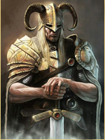
 Very detailed head, but you need to draw more little details, i think...