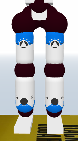
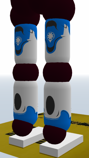
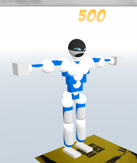
Original Post




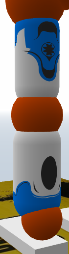
Originally Posted by Mzebra

*pubic opinions
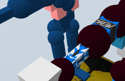
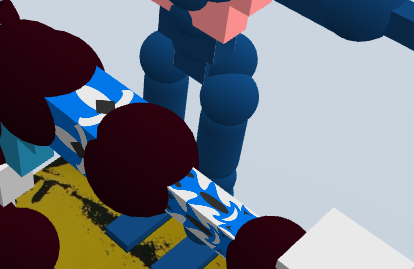
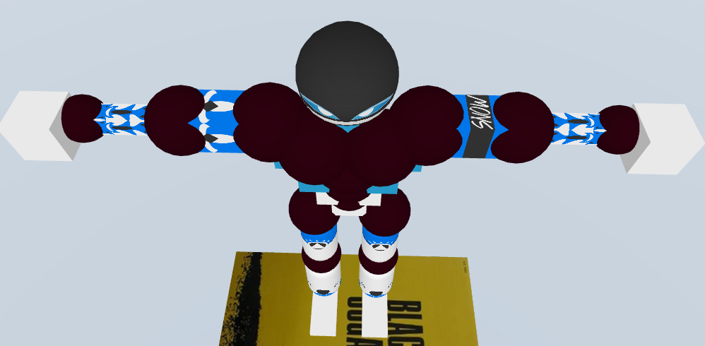
not sure what youre going for, its too plain. Dont tell me its minimalistic either, minimalistic has slightly more detail than that.
no, i'm pretty sure this is minimalistic
thanks tho
if you could give some more insightful cnc that'd be great
?pubic opinions? i don't get it

don't talk to me or my dudes ever again

simple creature are just the best.
looks very good for a simple set you'll do there. or i can say a set with white as it's maincolor. because the blue color on that one is too minim, fyi.
also your concept there are so creative. also please post it again in a complete version tho.
looks very good for a simple set you'll do there. or i can say a set with white as it's maincolor. because the blue color on that one is too minim, fyi.
also your concept there are so creative. also please post it again in a complete version tho.
Selling something? Need some toricredits? Click this quickly.
The warrior guided by the spirit serves humanity, the warrior without, serves the ego.
Main rival of ToriBot since 20&&
- made in Indonesia
- made in Indonesia
The warrior guided by the spirit serves humanity, the warrior without, serves the ego.
Originally Posted by 13chillz
But yea cnc, I would use bigger shapes for your accent lines because at any distance it feels like they would become irrelevant.
And your lines feel a bit wobbly and unfocused. And do I see mirroring v's?.
Maybe add more white into the black detailing, looks cool on the front.
i agree with all if it but they aren't v's
it's two of my accent lines at a point to draw some more attention away from the open space
idk how to fix 'wobbly' lines
 it's all pen tool, should be fine
Originally Posted by Raiken
simple creature are just the best.
looks very good for a simple set you'll do there. or i can say a set with white as it's maincolor. because the blue color on that one is too minim, fyi.
also your concept there are so creative. also please post it again in a complete version tho.
i have to use aqua as the 'main color'
don't talk to me or my dudes ever again