Original Post



[Tex]Another fail-try on Robotic Head. Feel free to help me.

Made in gimp 2.6.
Colored with Ink-Tool.
I really need tips and any other information on how to make a metallic effect in gimp.
Feel free to pm or even post those tips and info here.
Selling something? Need some toricredits? Click this quickly.
The warrior guided by the spirit serves humanity, the warrior without, serves the ego.
Main rival of ToriBot since 20&&
- made in Indonesia
- made in Indonesia
The warrior guided by the spirit serves humanity, the warrior without, serves the ego.

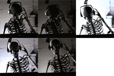
dude this is a great head i dont think its bad at all
The lines looks kinda messed up, well I'm going to fix those later. Thank you for the CnC anyway guys.
Selling something? Need some toricredits? Click this quickly.
The warrior guided by the spirit serves humanity, the warrior without, serves the ego.
Main rival of ToriBot since 20&&
- made in Indonesia
- made in Indonesia
The warrior guided by the spirit serves humanity, the warrior without, serves the ego.