

Original Post

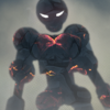

[Art]Shitty C4D Rendering
I started a month ago, I'll be posting my renders here sorted from latest to oldest. CnC and Rating is a must on each of these
Old


 [/IMG]
Levas


Zawes


Weird
 [/IMG]
Last edited by SKITZOFRENIK; Nov 23, 2015 at 02:30 PM.
I'm a wordsmith cursed with verses and the worst shit.
A vile winged wicked bird who no one lurks with.
A vile winged wicked bird who no one lurks with.


Everything but the first looks good, the problem with the first isn't the letters those look fine but the added tories look like shit the reason is you can see through 1 and the others are angled weird like with the prospective
-----
And also what is up with the blank space on the right?
-----
And also what is up with the blank space on the right?
Last edited by KDigityDog; Oct 30, 2015 at 12:29 PM.
Reason: <24 hour edit/bump
|Jacklox2| |Frost| |MrBeany| |Nugget| |Sheetboy| xFIRExGAME |
The blank space is a editting issue, will try to fix it. So the tori are shitty, and the text is overused. Might upload another one with a great crystal effect.
thanks for cnc
thanks for cnc
I'm a wordsmith cursed with verses and the worst shit.
A vile winged wicked bird who no one lurks with.
A vile winged wicked bird who no one lurks with.
BUMP NEW RENDERS
I'm a wordsmith cursed with verses and the worst shit.
A vile winged wicked bird who no one lurks with.
A vile winged wicked bird who no one lurks with.