
Toribash
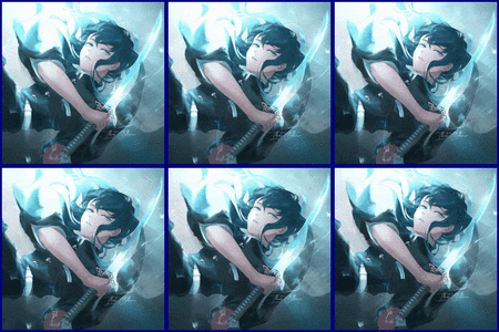
I hope I'm not late for this but I have a w.i.p of my own


Original


Add Effects

Last edited by Mist; Dec 16, 2015 at 02:33 AM.
~#1 Shittiest Shitposter of TP 2016~
[SIGPIC]https://cache.toribash.com/forum/signaturepics/sigpic2206760_23.gif[/SIGPIC]
Ex Co-Leader of Origin

Ok, so I have edited the logo, and changed the banner. I made the text a solid greyish color mixing up the side details. I can do this to all the banners if you'd like.


Last edited by Zwift; Dec 16, 2015 at 01:01 AM.
(╭ರᴥ•́)
Originally Posted by Zwift View Post
Ok, so I have edited the logo, and changed the banner. I made the text a solid greyish color mixing up the side details. I can do this to all the banners if you'd like.


This is kind of just a shot in the dark, but is there anyway you can make the recruitment banner and the other ones (not including the logo) look like paint is dripping from the letters. But still in the kind of dull colors your using. I just can't get behind the flames for them. But this is just my opinion, so you don't need to make anything just because I thought of something else.
If nobody's perfect and I'm a nobody, does that make me perfect?
Originally Posted by NiteNite View Post
Does vibrant colors and fancy flames truly represent spectators? I would totally be up for a biggass eyeball staring into my soul as if watching from a distance, away from harm and detection. Idk.

Idk.

Seems too Illuminati for me.


Fadibob's work is my favorite here.
Originally Posted by gabe0311 View Post
This is kind of just a shot in the dark, but is there anyway you can make the recruitment banner and the other ones (not including the logo) look like paint is dripping from the letters. But still in the kind of dull colors your using. I just can't get behind the flames for them. But this is just my opinion, so you don't need to make anything just because I thought of something else.

Hmm, I think making it drippy wont mix well with the natural theme. I think this color scheme has a nice elegant feel to it.
(╭ರᴥ•́)
How is my entry. Any comments?

Original


Add Effects

~#1 Shittiest Shitposter of TP 2016~
[SIGPIC]https://cache.toribash.com/forum/signaturepics/sigpic2206760_23.gif[/SIGPIC]
Ex Co-Leader of Origin
I like it and all, but it's very reminiscent of origin's art.
If nobody's perfect and I'm a nobody, does that make me perfect?
Originally Posted by NiteNite View Post
Try it. You talk as if you're the one asking US to make you art

You can never obtain anything great in life without taking risks. That is, my good sir, a fact.

kk, I will try it!
(╭ರᴥ•́)
Originally Posted by Zwift View Post
Hmm, I think making it drippy wont mix well with the natural theme. I think this color scheme has a nice elegant feel to it.

I agree with Zwift, I don't think that would be a good idea. I'm a fan of Zwifts current style. Also Zwift, when we said make the flames different, we didn't mean add more. I liked the lesser amount you originally had better, I just wanted there to be very slight differences in the flames of like the recruitment form the story. They don't have to be big ones. Also the text seems fine now, I like it.

Originally Posted by xxGangstaxx View Post
How is my entry. Any comments?

Original


Add Effects


Erm what gabe said, it looked pretty good with the effects, but it looked way to similar to your origin stuff in your sig. I don't wanna straight up copy other's here.
AnimePlanetMyAnimeListDiscord: Kohta#1577 • NikosTunaPouffyAubreyGuessTenRythm
• No longer "active" on Toribash. Leave a PM if you need something, I'll eventually see it. •
• Crippled/Disabled girls are the best girls a guy could have. •