


Originally Posted by pouffywall

[3:43:05 PM] Abel: hey guys
[3:43:17 PM] Abel: Zwift wants you to reply to his clan banners
[3:44:01 PM] Lukina: Banners can't talk
[3:44:06 PM] Nicger Shrek (Pouffywall): ^^
[3:51:10 PM] Abel: he seems like he's getting frustrated
[3:51:36 PM] Nicger Shrek (Pouffywall): I'm frustrated that he didn't listen to any of us ;~;
[3:52:04 PM] Nicger Shrek (Pouffywall): I don't even know what to say to him besides quoting everything I've said to him on the last five pages of our request thread
[3:52:11 PM] Abel: well voice your concern on the thread lol
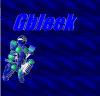
Colour: I don't have a lot of concern about the colour besides a.) I like grey in this context more than I like black/dark grey b.) the variety of purples and blues make it look a little more fruity than our name deserves.
Font: I don't know if you've been paying attention to the things I'm saying to other artists, but I really wish the font were a bit more fluid. As in, one letter leads to the next. I don't think a fully cursive font would be good, but a synthesis between what you have now and a really fluid font like cursive would be great imo. Not sure about other people
Flames:
- Asymmetry is your friend
- Creativity is your friend
- Variety and distinction is your friend
- Don't be afraid to allow the flames to take up space behind the text. It'd make it look a lot more organic and much less linear and mundane.
If I can't make it clear enough STUFF LIKE THIS APPLIES TO EVERYONE ATTEMPTING THE REQUEST (besides the flame bit, that's kinda specific to Zwift).
alright, sorry for not listening to your recommendations.. there was just so many I didn't know which ones to follow :cc. I will follow these though, thanks for clearing the parts that need work on up. I will try to use as you stated a more fluid font, I have a couple in mind. I will also use the space behind the text as an advantage for the flames.
(╭ರᴥ•́)

Originally Posted by Zwift
alright, sorry for not listening to your recommendations.. there was just so many I didn't know which ones to follow :cc. I will follow these though, thanks for clearing the parts that need work on up. I will try to use as you stated a more fluid font, I have a couple in mind. I will also use the space behind the text as an advantage for the flames.
Sorry about that, I'm having a rough week and was overly harsh. Truth be told, you're doing awesome work. I have absolutely nooooo idea why K0HTA is making all of us throw our opinions on the thread instead of work it out amongst ourselves and have a spokesperson, since it's obviously very confusing for the artists... He said something along the lines of, "We're paying them to run in circles." *Sigh*
Anywho, nice work and I'm looking forward to what you'll come up with next.
Gangsta:
Hmm.... This does look cool, but that's not... us, you know? These things in particular seem out of place:
The metallic sheen
The splatters
The "cut" lettering
The full coloured outline of the lettering - I like the idea of using touches of colour to emphasize the lettering, but bordering it completely seems like a bit much.
Those circles... I don't think circles like that are the way to do it, but I think you could make something similar work.