


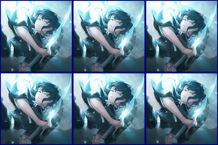

i tried making it more live like but i can remove it once you give me the second no
wip 2

~#1 Shittiest Shitposter of TP 2016~
[SIGPIC]https://cache.toribash.com/forum/signaturepics/sigpic2206760_23.gif[/SIGPIC]
Ex Co-Leader of Origin

You guys said the colors were a bit too fruity, so I darkened them a bit. I can do a different concept of the flames on each banner if you want.
Personally, I like the design I used in http://forum.toribash.com/showthread...541904&page=10 , but its up to you guys if you are willing to go with this current design.
New Design

Personally, I like the design I used in http://forum.toribash.com/showthread...541904&page=10 , but its up to you guys if you are willing to go with this current design.
Last edited by Zwift; Dec 22, 2015 at 01:13 AM.
(╭ರᴥ•́)

Originally Posted by xxGangstaxx

The smoke were there because it shows the theme of the art you guys wanted.
"creatures of the shadows that only watch the events of time play out, we do not interfere."
I could make the logo darker and more disappearing but i will change it.
Still thinking of making the Clan Logo different from the titles
I dont know where i was going with this but i've add the clouds that seemed similar to the image color
WIP

Originally Posted by xxGangstaxx
i tried making it more live like but i can remove it once you give me the second no
wip 2
I like the first one more than the second one, to be honest. I'll just reiterate that the only huge problem I saw with the first one was all the space being filled by only the clouds, so I would have suggested making the clouds smaller.
Just a heads up... I really like what Zwift and Fadibob are doing. I feel like they're very close to having what we want, and I'm not sure you continuing to work on it will be a good use of your time. However, if you do come up with something really cool and creative and think it'll work, feel free to stop by and show us.
Originally Posted by Zwift
You guys said the colors were a bit too fruity, so I darkened them a bit. I can do a different concept of the flames on each banner if you want.
New Design
Personally, I like the design I used in http://forum.toribash.com/showthread...541904&page=10 , but its up to you guys if you are willing to go with this current design.
Ooh~ I like it. I can see a few things right now that I don't like, but this was a huge step in the right direction, I think, and you're getting close.
I'll think about this for a bit. I want to identify the exact elements that I think should be removed and added, and I'll add onto this post when I do. I think it'll be more time efficient for all of us if I do that.
«
Previous Thread
|
Next Thread
»