



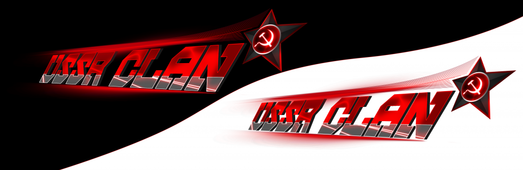
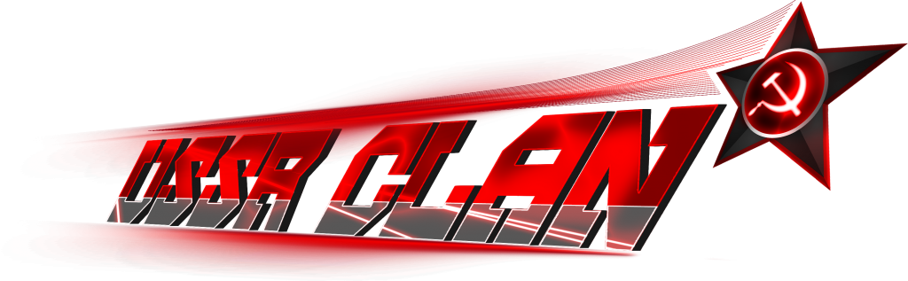

That's more of a banner than a logo but okay... The Logo would be the top right star/original logo, rest of it makes it into a banner. Looks nice nonetheless, I love it
[SIGPIC][/SIGPIC]
Happy Halloween!!!!!
[u]Ultimate | Team Shit-ido | National GayTerrorist Club |Photoshop Corp.
ELVIS ELVIS ELVIS ELVIS ELVIS ELVIS ELVIS---BootyShorts
R.I.P UNDEAD21, Beta, and Assazin
Happy Halloween!!!!!
[u]Ultimate | Team Shit-ido | National GayTerrorist Club |Photoshop Corp.
ELVIS ELVIS ELVIS ELVIS ELVIS ELVIS ELVIS---BootyShorts
R.I.P UNDEAD21, Beta, and Assazin


The most bottom point of the star, follow the line upwards from there, the inner line to the left. Notice how the star line is not aligned to the text line. Kills the flow. Fix.
Last edited by Freelancer; Sep 4, 2013 at 05:43 AM.
Jalis: Freelancer, you're a duck | Sachi: Freelancer, you're a duck | Reanimator: Freelancer, you're a duck
satiknee: Freelancer, you're a duck | Wiggi: Freelancer, you're a duck | Tarlan: Freelancer, you're a duck
satiknee: Freelancer, you're a duck | Wiggi: Freelancer, you're a duck | Tarlan: Freelancer, you're a duck