

Original Post


Kinda Rusty..
been a long time since i touch photoshop
kinda rusty atm
i cant make robot nicely since i only do cartoons so.. yeah
made with Photoshop 7.0
CnC much appreciated
my best robot head i've ever made i guess..
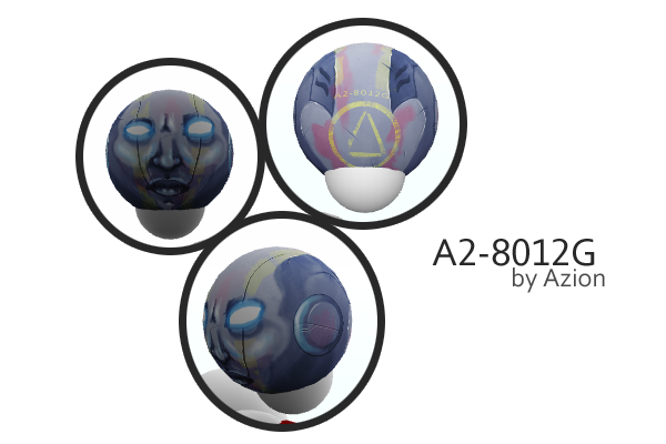
i cant make robot nicely since i only do cartoons so.. yeah
made with Photoshop 7.0
CnC much appreciated
Discord : bintangfal
ES Art Team
Alright... Here comes the good stuff.
Id recommend u work on the nose, or add a pattern instead of a nose.
and that wear 3 lines thing on the forehead is ruining the style, instead just add a symbol.
the left eye is smaller than the right eye,try to mirror them.and on the face there should be more shading.
Id recommend u work on the nose, or add a pattern instead of a nose.
and that wear 3 lines thing on the forehead is ruining the style, instead just add a symbol.
the left eye is smaller than the right eye,try to mirror them.and on the face there should be more shading.
RIP TGS 2013 - 2019
The eyes and mouth, atleast in my opinion are too far apart, from the screenshots it looks like his mouth is on his chin and his eyes are too high up.
Other than mapping and the eye being smaller it looks great!
Other than mapping and the eye being smaller it looks great!
I'm the Event Squad Admin. I am also an ex-Clan Squad member. Have any questions about clans or otherwise? PM me.
[sigpic][/sigpic]
Discord: Typhus#0201
splish splash Aeon is still trash
you have to work more on the nose, it looks so flat, the distance of the nose and the mouth are also too far, in my opinion
the yellow color didn't really suits too in my opinion, but the other color selections are pretty much acceptable from my prospective
meanwhile the shading on the sides are really neat, loved those parts
keep up the good work
the yellow color didn't really suits too in my opinion, but the other color selections are pretty much acceptable from my prospective
meanwhile the shading on the sides are really neat, loved those parts
keep up the good work