
Originally Posted by snake

if you can't or don't want to get the mapping right is a glaring issue in what you do.
and if you don't want to address it - it's your problem. don't ask me to turn a blind eye on the most important aspect of texturing.
why do you even care what everyone/not everyone is doing? your mapping is WAY off. and instead of actually focusing on getting it right, you do whatever the hell you do and expect cnc on that? really?...
if this texture was for me i would have told you this: "redo it, make the mapping right and show again"
what's the point in shading/colours if you can't get the shape?
the most fundamental aspect of texturing is correct mapping, if you don't want to care about the mapping - don't do textures - do art.
for me as a reviewer i don' care how you do your textures 512x512 or 1024x512, only the end result matters, and the end result is the same as before
so far, you seem to be systematically unable to get the mapping correctly, which is the most fundamental part of texturing.
and worst of all, you are refusing to address it and ask us to turn a blind eye on it
i would have turned down this texture if it was for me, and told you to re-do it until the mapping is right, plain and simple,
if you are offended by people pointing out your weak sides, then don't ask for cnc,
if you don't want to be bothered with the mapping - don't do textures, do art
practice your mapping to get it right first, and only after mastering it, move on to colors/shading
again, nobody cares if you do it 1024 or 512, only the end result matters
hey uh... i think he has something against your mapping
i wish there was a rule for redundancy when criticizing. just a note for you snake: a reviewer is less credible when hes saying the same thing over and over. keep it to the point unless you have other things that irk you.
true, criticism doesnt mean a compliment, however remember it needs to be CONSTRUCTIVE. (heh, i did the caps thing like snake does to make it look really important). telling him he's doing something wrong is completely different than telling him how to fix it and how to avoid the mistake. saying "do 1024x512 to fix it" is not helpful.
anywho, since its the subject, im going to also address it. rumaging through everything that was said, i dont think anyone told you specifically what was wrong with your mapping.
theres a template for head textures that im sure you have. its labled front and back. typically the middle of the "front" circle will be your focal point. the horizontal perspective is spot on in my opinion, however i personally wouldve raised the face a smidgen, and then the entire head up. youll generally want a balance of space between the top and bottom of the texture
also
Originally Posted by Karbn
Hey flyingmonk 2.0
hes not flyingmonk 2.0 until he gets banned for something art related

yo waddup, roi!
don't listen to snake because your mapping is fine. although, I advise using a 1024x512 template since its much easier to map and get certain details in.
even though it's hard, just try and try. I also started off 512x512 but after using 1024x512, I automatically switched to it.
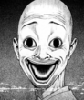
about your head, mapping is fine but I'm 100% sure it'll be much better if you map it in a 1024x512. I really love the eyes and the skin shading/shadows. robot part has a nice design and glow to it. though, I feel weird about the top of the head though, looks like his forehead is the size of (insert something big here). maybe it's just me since I haven't seen a lot of bald textures.
overall, I really love your art (as always). keep improving man, I see a bright future ahead of you!
ps: just do 1024x512 ♥
don't listen to snake because your mapping is fine. although, I advise using a 1024x512 template since its much easier to map and get certain details in.
even though it's hard, just try and try. I also started off 512x512 but after using 1024x512, I automatically switched to it.
about your head, mapping is fine but I'm 100% sure it'll be much better if you map it in a 1024x512. I really love the eyes and the skin shading/shadows. robot part has a nice design and glow to it. though, I feel weird about the top of the head though, looks like his forehead is the size of (insert something big here). maybe it's just me since I haven't seen a lot of bald textures.
overall, I really love your art (as always). keep improving man, I see a bright future ahead of you!
ps: just do 1024x512 ♥
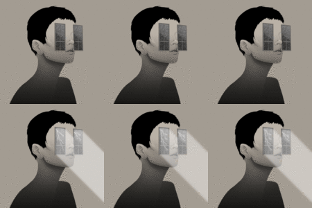
Woot, alright well. I decided to try something different from my usual style
This gone be some non-toribash related stuff. I tried working on my shading, lighting, how I do hair overall.
This was the result and tbh I am proud of how it turned out, compared to my other non-tb related stuff, this is one hell of a step-up.
For any of y'all that do know a good bit about this stuff, hit me up with some cnc, there's gonna be a good bit of this put into this thread as I need a portfolio of these (around 10-20).
Ps - My irl nickname is Wybie kcool
Also due to people saying that the previous head had a clash of style with the back not having any subtle glow, fixed that.
Also, next head will be 1024x512 k cool
This gone be some non-toribash related stuff. I tried working on my shading, lighting, how I do hair overall.
This was the result and tbh I am proud of how it turned out, compared to my other non-tb related stuff, this is one hell of a step-up.
For any of y'all that do know a good bit about this stuff, hit me up with some cnc, there's gonna be a good bit of this put into this thread as I need a portfolio of these (around 10-20).
Portrait

Ps - My irl nickname is Wybie kcool
Also due to people saying that the previous head had a clash of style with the back not having any subtle glow, fixed that.
Flat

Preview
Also, next head will be 1024x512 k cool
Last edited by R0i; Jan 27, 2018 at 10:31 AM.
amazing quality, shading and color pallet but the sizing of the face doesn't fit the head whatsoever
you should try to make the face taller and just a tab bit wider
take some previous references from dengue who has made tons of humanoid textures
another thing that id say is that this concept has been redone and made well so many times it's become pretty bland
it doesn't take away too much from the quality, yet i'm sure you can get more creative
you should try to make the face taller and just a tab bit wider
take some previous references from dengue who has made tons of humanoid textures
another thing that id say is that this concept has been redone and made well so many times it's become pretty bland
it doesn't take away too much from the quality, yet i'm sure you can get more creative
don't talk to me or my dudes ever again
Originally Posted by hobo
amazing quality, shading and color pallet but the sizing of the face doesn't fit the head whatsoever
you should try to make the face taller and just a tab bit wider
take some previous references from dengue who has made tons of humanoid textures
another thing that id say is that this concept has been redone and made well so many times it's become pretty bland
it doesn't take away too much from the quality, yet i'm sure you can get more creative
Appreciate the criticism my guy. I will keep it in mind whenever I make a head similar to that, it's been sold anyway.
I will check out more of Dengue's stuff, from some artworks I've been seeing of his here and there especially with his set, I can tell he has a good bit experience.
Also, here's another portrait, non tb related stuff ofc:
Portrait thingy

Cnc is much appreciated